Why Our Start Screen Isn't a Dashboard – and Why That Matters
A dashboard isn't the first thing you'll see in Trebellar. That's by design. Watch this Product Spotlight to learn why.

Over the past few months one question keeps popping up: “Where’s the dashboard?"
Short answer: It’s not the first thing you see in Trebellar. And that's by design.
Dashboards Are a Means, Not the End
Traditional dashboards are useful for displaying numbers and visualizing trends — but they have a number of limitations that can impede decision-making.
Cognitive overload – Scanning 10-15 charts just to spot what changed or which trend to focus on.
Flat information hierarchy – All charts and metrics are presented with roughly the same visual weight, regardless of relative urgency or importance.
Missing context – Numbers alone don’t explain why the spike happened or what to do next.
With the advent of AI, our view is that there's a faster, easier way to translate data into decisions.
Our Alternative: Insight-First, Role-Aware
When you log in, Trebellar runs fresh data through our AI layer and surfaces a short, plain-language brief tailored to your role:
| If you are… | You might see… |
|---|---|
| Portfolio Manager | “Three leases expire in 120 days; renewing at market rates could raise annual rent by 12 %. Consider consolidation scenarios.” |
| Workplace Planner | “Desks in NYC are 42% under-utilized YTD. Rebalancing seats could save $180K in OPEX.” |
| Executive Leader | “You're on track to run out of seats in HQ 5 months sooner than originally forecasted. Would you like me to find some options to solve this?” |
With these insights, users can then jump directly into a Trebellar module to work the problem – whether that's running capacity modeling in the Bay Area, assessing the likely ROI of flex scenarios in Dallas, creating a generative report for this week's All Hands, or digging in on employee engagement scores in London.
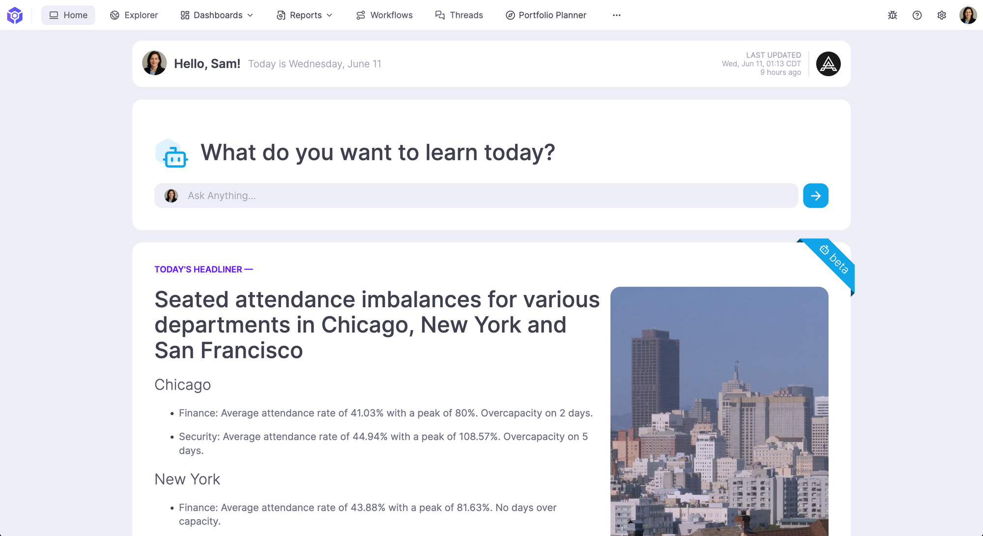
The Impact
Our goal is to reduce the amount of time and effort it takes to get to a confident decision. We believe a start screen that's refreshed with dynamic, personalized content gets users closer to this goal than dashboards.
Faster time-to-decision – Teams can quickly identify key trends and issues.
Higher confidence – Insights come with context, projections, and recommended actions.
Focus on what matters – Urgent items rise to the top, so nothing critical slips through the cracks.
Want to Give it a Try?
Our dynamic start screen is currently in beta, and our product team is actively iterating on customer use cases and feedback. If you'd like to learn more or share some of your desired outcomes, reach out to our team!
PS: For the dashboard die-hards: Yes! You can still set any dashboard as your personal home screen. We just think you’ll find value in having a shortcut to answers.